How to Visualize Value: Design Course
This is a summary and a review of the course How to Visualize Value — Design Fundamentals by Jack Butcher.
Course Background
The core idea behind the course is this: express your ideas using shared visual references.
“Our shared visual references outstrip our shared verbal references, they don’t rely on us having the same vocabulary, speaking the same language, or studying the same topics.”
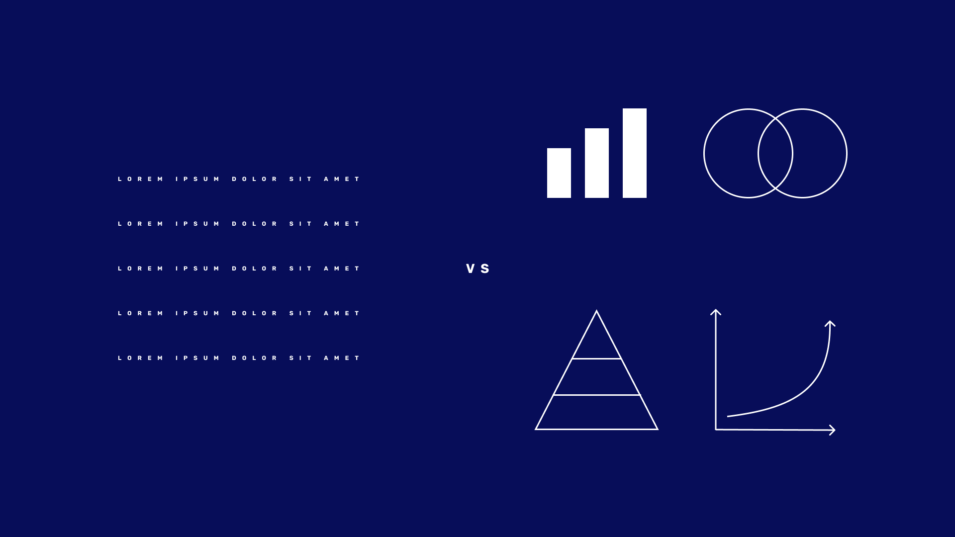
Here’s my crude representation of the idea.

Target Audience
The course is for anyone who wants to add a new dimension to their communication. For non-designers, it’s a guide to the core principles of design and an introduction to Figma. For designers, it’s a different perspective into how to communicate using design.
Key Takeaways
- “Visual communication, when leveraged well, creates a massive advantage.”
- Pick a couple of typefaces and stick to them. Use contrast in size to make them come alive.
- When communicating the value of something, you have to demonstrate the transformation.
- Build a content system using TRAIN: Typography, Restraint, Alignment, Image Treatment, Negative Space.
- “Build a visual system that constrains you, and your ideas will get better with every iteration.”
- The better the alignment, the more satisfying the work is to look at. Use a golden ratio grid as an aid (this is more powerful than I realised).
- “Remove everything you can that isn’t absolutely necessary.”
- “Publishing content in a consistent, curated manner will help you build brand equity and attract a loyal audience.”
My Experience with the Course
This course was fun! But most importantly it was valuable. I measure the value of a course by whether it generates mindset shifts or not. Well it did.
Prior to taking the course, I told myself I’m not “ascetically attuned”. But now I’m seeing that I don’t have to be a designer to enhance my work with visuals to increase delight.
I realised I’ve been communicating in 2D. There’s a powerful tool in communication that I’ve been blind to. Of course, the impact of visuals when conveying ideas is nothing new to me. I just hadn’t considered that it’s accessible to me. This is not to underestimate designers. Creating visuals has shown me just how hard design is. But you don’t have to be a chef to cook decent food.
If you’d like to connect, I’m active on Twitter. I’d love to hear your thoughts.